Tufte, The Visual Display of Quantitative Information
Summary
This book seeks to maximise the performance and beauty of graphics through sequential revisions and maximisation of key principles derived from art, architecture, and prose.
Key principles are that the designer should maximise data-ink, remove all 'chartjunk', and to design the graphic to maximise understanding.
Notes
- Introduction
- Graphics are instruments for reasoning about quantitative information
- They are effective ways to summarise large datasets and information
- The book proposes principles for presenting information
- Part 1: Graphical Practice
- Graphical displays should:
- Show the data
- Induce the reader to think about the substance, not the methodology
- Avoid distorting what the data have to say
- Present many numbers in a small space
- Make large data sets coherent
- Encourage the eye to compare different pieces of data
- Reveal the data at several levels of detail, from broad overview to fine detail
- Serve a reasonably clear purpose
- Be closely integrated with the statistical and verbal descriptions of a data set
- Graphics reveal data
- Graphical excellence is the efficient communication of complex quantitative ideas
- Graphics should be reserved for richer, more complicated material than a linear relationship
- Graphical excellence is that which gives the viewer the greatest number of ideas in the shortest time with the least ink in the smallest space.
- Graphical displays should:
- Part 2: Theory of Data Graphics
- Data ink ratio = data ink / total ink used to print the graphic
- That is, the proportion used to non-redundant display of data information
- Maximise the data ink ratio, within reason
- Erase non data ink, within reason
- A designer should ruthlessly prune out unnessary 'ink' that fails to present fresh data information.
- Computers produce a lot of 'chartjunk' instantly. This is unnecessary clutter:
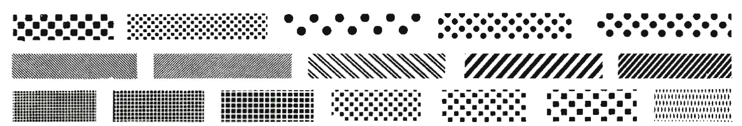
Examples of chartjunk
- Cross-hatching should be replaced with shades of grey - Specific areas should be labelled with words, not cross-hatching - Mobilise every graphical element, perhaps several times over, to show the data - Maximise data density and the size of the data matrix, within reason - Data density = number of entries in a data matrix / area of data graphic - Graphics can be shrunk way down - Graphical excellence is often found in simplicity of design and complexity of data. - If the nature of the data suggests the shape of the graphic, follow that suggestion. Otherwise, move toward horizontal graphics about 50% wider than tall - Data ink ratio = data ink / total ink used to print the graphic